Fantasy novel cover art
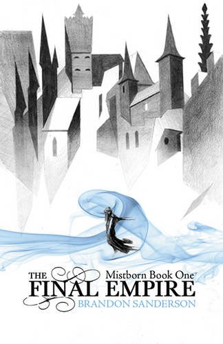
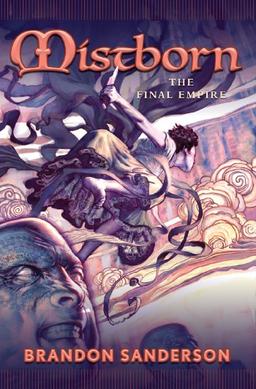
Thought I’d just put this out here, I’ve noticed that the American cover art and British cover art tend to be very different, the British ones tend to be more minimalistic with a little overdose of “Hooded-ninja-wizard” whereas the American ones seem to have more in them, like they’re displaying a scene from the book.
Just wondering, which does everyone prefer and why? I kinda prefer the British ones (although I might be biased there, I’m too used to them) as the American ones seem a bit cheesey and off-putting a lot of the time.
Examples (including some hooded-ninja-wizards):
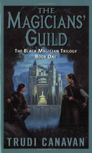
Feel free to bring up other countries covers as well. I just picked those two as they’re the ones I see most often.
My editions from Spain tend to look like daytime soap operas.
The Japanese , unsurprisingly, is manga-like.
French is flowing and stately .
If you are viewing this on github.io, you can see that this site is open source. Please do not try to improve this page. It is auto-generated by a python script. If you have suggestions for improvements, please start a discussion on the github repo or the Discord.