We’ve gone far more realistic these days in fantasy art than Darrell’s style was complimentary toward. However, when I first got into fantasy books, the covers were not like what we had today. The genre was still in its infancy, and fantasy illustration was equally youthful. Publishers were still trying to figure out how to illustrate it. We usually either got conceptual covers like the sf ones you can find on this thread or, far worse, the dreaded woman in a chain mail bikini—a trope I consider downright stupid in a genre almost universally populated with strong female protagonists.
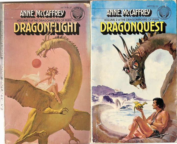
(Note that I don’t intend this as a dismissal of Frazetta or Vallejo. Though I wouldn’t consider myself a fan of that style, often their art was on the right books. A Conan cover SHOULD have art like that. However, this style (as seen in this link ) was even prevalent on things like the Pern books, where it didn’t belong.)
For more research, look through this whole archive of fantasy and sf covers , many from that era. That was the sort of thing we were dealing with. Grim, dour, oiled up, or silly was the norm. With that in mind, compare what Darrell brought to us .
If you are viewing this on github.io, you can see that this site is open source. Please do not try to improve this page. It is auto-generated by a python script. If you have suggestions for improvements, please start a discussion on the github repo or the Discord.